Oren’s Reading List: Stand Right and Stand Left?!?

I imagine many of the people who come to my site have strong opinions about escalator etiquette on public transportation.  In cities such as Washington or London, standing on the right side of the escalator and walking on the left is an ingrained habit.  But is it the fastest way for everyone to get to the bottom or top of the escalator?

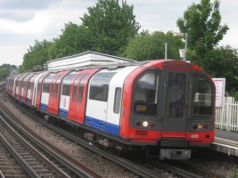
Last year, Transport for London conducted an experiment at its Holborn Station where commuters were asked to stand on both sides of the escalator.  The result might surprise you.  When the escalators were at their busiest, they were able to carry more people per hour when everyone stood and no one walked on the left side.  This article from The Independent explains why that is the case.  Take a read and then feel free to offer your thoughts on the study in the comments below.  Is this the result you expected?  Do you prefer to walk or stand? 

Oren’s Reading List is an occasional feature on The Travelogue in which I share articles that I’ve read that might also be of interest to the readers of this website.
Oren’s Reading List: How London Tube Stations Got Their Names

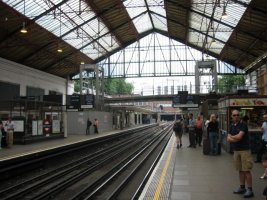
If you’ve been to London, you may have noticed that some of the Tube stations have some, shall we call them, interesting names.  Examples include Cockfosters, East India, Marylebone, Oval, and Tooting Bec.  I’m sure someone has already compiled the origin of all these station names and posted them online somewhere (though I can say with some confidence that even I can figure out how a station like “Baker Street” gets its name), but the BBC recently posted an article highlighting ten stations and how got their names.  The ten stations are: 

  1. Covent Garden
  2. Elephant & Castle
  3. Cockfosters
  4. Tooting Bec
  5. Knightsbridge
  6. Maida Vale
  7. Aldgate
  8. Piccadilly Circus
  9. Queensway
  10. Shepherd’s Bush

You can read the article here.  

What is your favorite Tube station (or Tube Line) name?  Which station’s name origin do you wish you knew more about?  Share your responses in the comments below!

Oren’s Reading List: How the London Tube Lines Got Their Names

If you’ve been to Washington or Chicago, you know that subway lines are named for colors.  If you’ve been to New York City or Paris, you know that trains are referred to by a number of letter.  Around the entire world, identifying subway lines by color, number, or letter is common.  But in London, all the Tube lines have names.  Did you ever wonder where those names come from?  This article from Londonist reveals all.  While some names are portmanteaus of the destinations they serve (i.e. Bakerloo), others have more complex histories.  

Oren’s Reading List is an occasional feature on The Travelogue in which I share articles that I’ve read that might also be of interest to the readers of this website.

London U-Bahn Map

Did you ever expect to see the London Underground or “The Tube” referred to as the U-Bahn?  U-Bahn is the German term for subway and is used in just about each German city that has an underground rail network.  Yesterday, I shared a 1973 London Underground map with you.  Today, I’m sharing another London Underground map, except this one is from 1975 and printed in German for the benefit of German speaking tourists.  I don’t speak or read German aside from knowing a few select words, but my guess is that the texts on this map are just straight translations from the standard English language that would be used to German.  It is certainly an interesting addition to my collection as I don’t think I’ve ever seen a London Underground map in a language other than English.

Here are the scans of the map.  You can click on each image to make it larger and see it at full size.

london-underground-1973-german-page-1-t london-underground-1973-german-page-2-t london-underground-1973-german-page-3-t

Taking a Look at the 1973 London Underground Map

As I mentioned last week, I recently inherited a number of old maps from a variety of places around the world and they are now a part of my collection of maps and other transit memorabilia.  I plan to share some of the more interesting additions from this inheritance here on The Travelogue in the coming weeks.

This is a 1973 London Underground Map.  While the London Underground map design has remained fairly constant since Harry Beck’s initial diagram in 1931, there are some notable things on this map that are not the case today.  These include:

  • The Piccadilly Line to Heathrow Airport is under construction
  • The Jubilee Line is not yet open and Bakerloo Line trains operate the branch to Stanmore
  • The Hammersmith & City Line is still depicted as part of the Metropolitan Line
  • The East London Line has a partial identity of its own, but it is depicted in Metropolitan Line purple as opposed to the orange color it would have later on
  • The Docklands Light Railway is not on the map and will not exist for another 14 years

What other differences do you see?  You can click on the images to make them larger.  I apologize for any issues with the quality as the maps were scanned, converted to JPEG, and then compressed to a size manageable for sharing here on Oren’s Transit Page.

london-underground-1973-map-english-1-t

london-underground-1973-map-english-2-t london-underground-1973-map-english-3-t


Oren’s Reading List: London Publishes Geographically Accurate Tube Map

Have you ever thought to yourself while riding a train that even though the subway map seems to suggest the stations are evenly spaced, they aren’t actually so in reality?  You’re right to notice this.  Subway maps have been drawn without using a scale for a long time.  The first example of such a map is Harry Beck’s London Underground Map form 1931.  Many of the principles that Beck used in designing this map are still not only used in London but in many other cities around the world.  However, people sometimes draw scale versions of various maps to show the differences between the official map and what a scaled map would look like.

Officially, Transport for London (TfL) has not put out a geographically accurate map since Harry Beck’s diagram became the official one in 1933.  However, following a freedom of information request in 2014. TfL released such a map for the first time in many years.  Read about the FOI process and see the map for yourself in this story from The Independent.

In upcoming posts, I plan to share some old maps that I recently inherited and added to my collection, the first of which will feature maps of the Underground.  Stay tuned…

Oren’s Reading List is an occasional feature on The Travelogue in which I share articles that I’ve read that might also be of interest to the readers of this website.

Oren’s Reading List: The World’s 15 Most Complex Subway Maps

Ever look at a subway map and think to yourself “how on earth am I ever going to figure out where I’m going by using this thing?”  Recently, a group of theoretical physicists and mathematicians attempted to figure out which maps “exceed our cognitive limits.”  If you think the New York City subway map is overwhelming, the research team would agree with you.  You can read a summary of the study’s findings and see the list of the 15 most complex maps at CityLab, or you can read the entire paper (it is only 8 pages) at ScienceAdvances.

Oren’s Reading List is an occasional feature on The Travelogue in which I share articles that I’ve read that might also be of interest to the readers of this website.